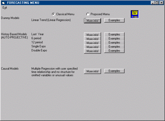
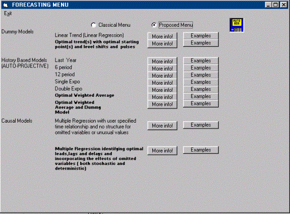
AUTOBOX
We will discuss a number of
interesting examples where the power of AUTOBOX shines through. The examples
will be both Univariate and Multivariate where Univariate is a single series (historical
sales forecasted) and Multivariate encompasses supporting or helping variables
in the sense of regression.
Consider a case where we only have 4 data points with each one taken one hour apart. By using data at each minute we are able to increase our sample size to 240 from 4. We are not really increasing the number of samples, but the statistical calculation is done as if we have, and so the number of degrees of freedom for the significance test is falsely increased and a spurious conclusion is reached. This is one of primary causes of "spurious correlation". By taking observations at closer intervals we create a time series with higher and higher autocorrelation. Our job is to somehow adjust for this type of intra-relationship (within series) and its effects on test statistics.
Let’s assume that if you were to test the significance of the slope for 4 data points and arrive at the conclusion that there is not a statistically significant slope. However, if we use the 240 observations and run our test we will be inducing significance. This is due to the fact that the statistical test is based on the ratio of the parameter to its standard error. The standard error will be lower due to the artificial increase in sample size and we will be falsely concluding significance when there is none.
Most forecasting textbooks,
attempting to explain or sell the concepts
present simple examples which require simple explanations and simple
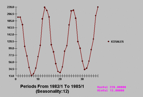
tools. For example, consider the case of
monthly Ice Cream Sales in Norway.
Couldn’t be easier!
Textbooks then proceed to
develop alternative approaches on an ad hoc basis to study such phenomena. The normal focus is to list possible models
without a clue as to how the models inter-relate . Model selection is done on
either an out-of-sample basis or some within sample statistic. The
out-of-sample approach fails a test of objectivity because it hinges on the
number of values you have decide to withhold.
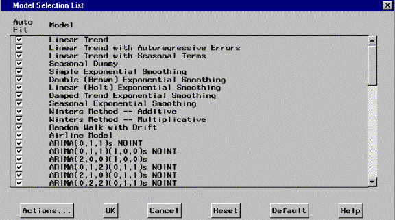
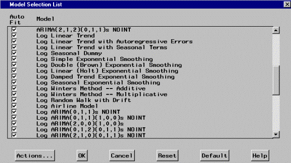
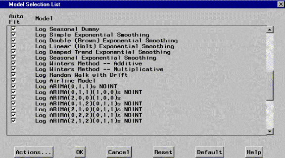
Here is an example of the
typical model selection process offered by simple textbooks or simple software.
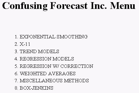
Very little discussion , if
any is made of the Family Tree of forecasting and how models relate to each
other.
For example:
The three components of a
forecasting model are ( in no particular sequence )
.Dummy Variables
.History of the series of
interest
.Causal Variables i.e.
potentially supporting series
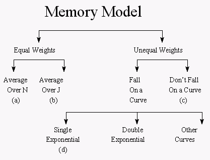
Following is a traditional
and usually insufficient presentation
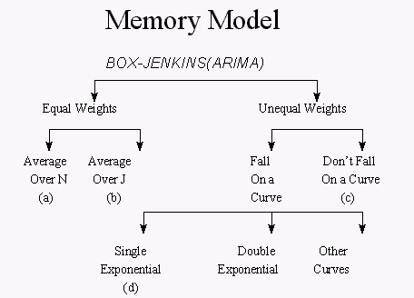
This can be and should be
expanded to
We know return to our simple example.
Note that when the Ice
Cream data is scrutinized by
AUTOBOX it returns a fairly
straightforward forecast.
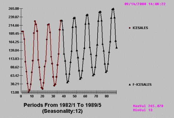
but so could all packages
and approaches ! Many of which are cheaper and easier to use (understand) than
AUTOBOX.
But on the other hand , in
the real world the practitioner is often faced with more demanding examples:
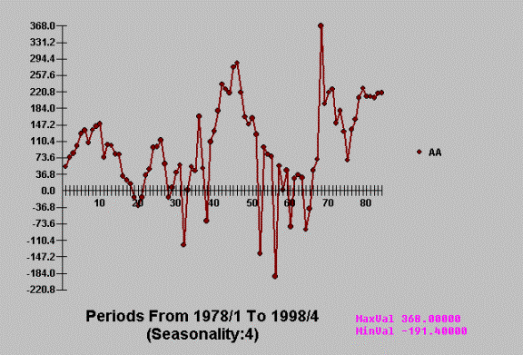
This disconnect between the
simple and the complex causes ad hoc modeling procedures to self-destruct.
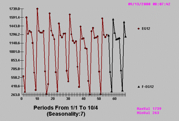
AUTOBOX takes this relatively complicated problem and reduces it to the
following…….
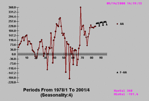
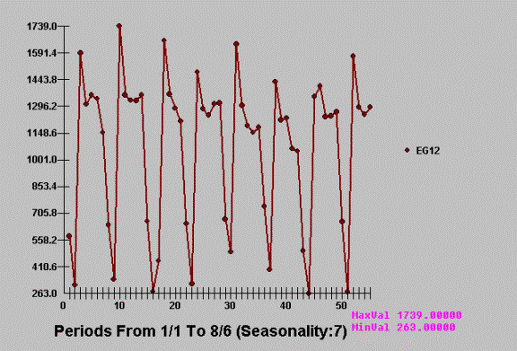
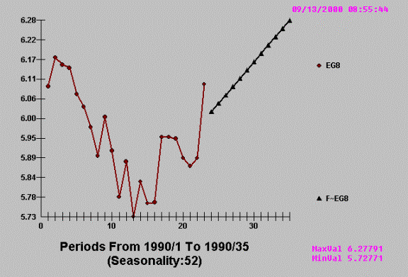
![]() Employing pattern recognition to deduce a quarterly
effect. Notice the 3 high and 1 low
pattern?
Employing pattern recognition to deduce a quarterly
effect. Notice the 3 high and 1 low
pattern?

The idea is that complex
approaches or tools should deliver simple answers when simple answers are
appropriate and complex answers when complex answers are appropriate.
Univariate
Example A
 How can the average be unusual? If a value is too
close to the mean, can it be detected as unusual ? When is the expected value
equal to the average ?
How can the average be unusual? If a value is too
close to the mean, can it be detected as unusual ? When is the expected value
equal to the average ?
![]()
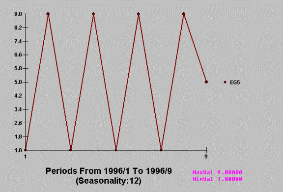
We have just observed the value
5 at time period 1996/9. What to do ! How to forecast ? How to detect an Inlier
?
The problem is that you can't catch an outlier
without a model for your data. Without
it how else would you know that an observation violated that model? In fact,
the process of growing, understanding, finding and examining outliers must be
iterative. This isn't a new thought. Bacon, writing in Novum Organum about 400
years ago said: "Errors of Nature, Sports and Monsters correct the
understanding in regard to ordinary things, and reveal general forms. For
whoever knows the ways of Nature will more easily notice her deviations; and,
on the other hand, whoever knows her deviations will more accurately describe
her ways."
Some analysts think that they can remove
outliers based on abnormal residuals to a simple fitted model sometimes even
"eye models". If the outlier is outside of a particular probability
limit (95% or 99%), they then attempt to locate if there is something missing
from model. If not, they remove the observation. This deletion or adjustment of
the value so that there is no outlier effect is equivalent to augmenting the
model with a 0/1 variable (dummy) where a 1 is used to denote the time point
and 0's elsewhere. This manual adjustment is normally supported by visual or
graphical analysis ... which as we will see below often fails. Additionally
this approach begs the question of "inliers" whose effect is just as
serious as "outliers”. Inliers are " too normal or too close to the
mean" and if ignored will bias the identification of the model and its
parameters. Consider the time series 1,9,1,9,1,9,1,9,5 and how a simple model
might find nothing exceptional whereas a more rigorous approach model would
focus the attention on the exceptional value of 5 at time period nine.
To evaluate each and every unusual value
separately is inefficient and misses the point of intervention detection or
data-scrubbing. A sequence of values may individually be within
"bounds", but collectively might represent a level shift that may or
may not be permanent. A sequence of "unusual" values may arise at a
fixed interval representing the need for a seasonal pulse "scrubbing”.
Individual values may be within bounds, but collectively they may be indicative
of non-randomness. To complicate things a little bit more, there may be a local
trend in the values. In summary there are four types of "unusual
values" ;
1. Pulse, 2. Seasonal Pulse, 3. Level Shift
and 4. Time Trends .
In order to assess an
unusual value one needs to have a prediction. A prediction requires a model.
Hopefully the model utilized is not too simple, just simple enough.
The evidenced pattern is
exploited and used to identify the anomaly at the most recent point in time.
The history of the series is
1,9,1,9,1,9,1,9,5 whoops !
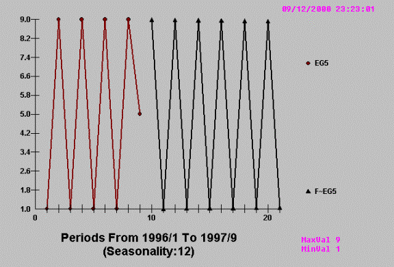
Thus the required action is
clearly evident from a visual examination. AUTOBOX duplicates the eye’s
detection of an unusual value …..reports it and in this case ignores it.
Some answers ….the mean is
equal to the expected value when the series or set of vales can be described by
a Normal Distribution (uncorrelated, constant variance, no unusual vales,
constant model over time).
EXAMPLE B
When you try and shoehorn or
force a model into a pre-defined set or list then funny (bad) things can
happen. Consider a series of 27 monthly values.
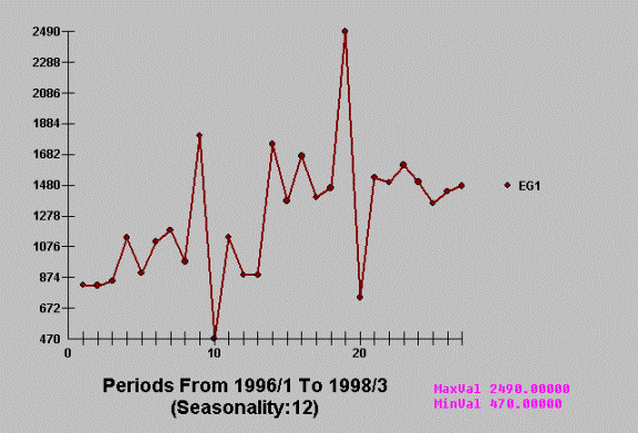
One of our competitors, when
analyzing this series, concludes that it has both trend and seasonal factors
….neither of which can be supported by a “t test” or an “F test”. They
misconstrue a shift in the mean at the 14th data point to signal
permanent upward trend and the four unusual values to represent statistically
significant seasonal patterns.
AUTOBOX on the other hand
detects both the level shift and the four unusual values and responds to the
new mean or level and ignores or discounts the four anomalies as not being part
of the underlying process and therefore should not be propagated into the
future.
It is somewhat disconcerting
to think that users of this competing software are gullible enough to accept
such analysis even if it originates in North Carolina. It just proves the point
that it is not sufficient to obtain the best parameter estimates one
also needs the best model. Limiting the solution to a pre-defined set can be
disastrous.
Before leaving this consider
the details of the inappropriate solution:
Here the models from the
ASSUMED “pick best” list of models:
More models from the list
(Note: The full list of models is INIFINITE so anything less is less)
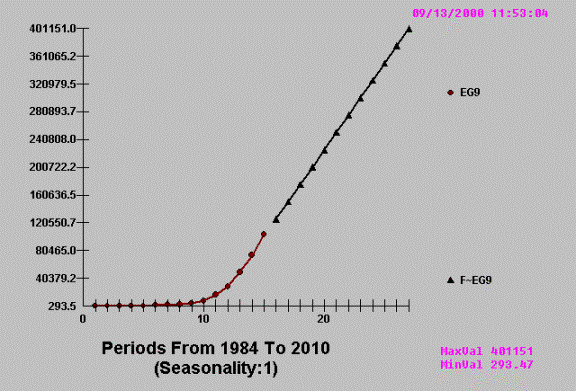
Example C
As positive thinkers we are
all inclined to project upwards …..
Consider the following
example
Does this series evident a trend?
To some ….the answer is yes …. to AUTOBOX the answer is a resounding not
proven.
Compare this to a series
that has evidenced and statistically proven trend and in this case two
distinctively different trends.
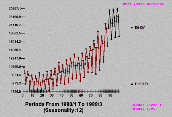
Example D
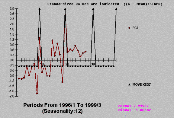
Some apparently simple
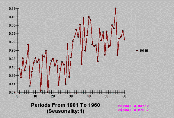
problems often are not so simple. Consider daily telephone calls recorded by
British Tel over a period of 55 days. Can you detect an important outlier or
unusual value? I couldn’t until I was told by AUTOBOX where to look for it!
This is a very “busy” graph
….full of information and as we shall “see” some misinformation.
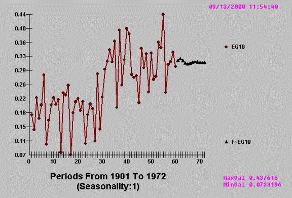
where Red indicates actual
(dots) and Black (triangles) reflect the series cleansed of outliers. Note how
our eye had missed the very unusual activity at time period 16 and 17.
This leads naturally to the
following robust forecast where the model parameters are not affected by the
anomalies.
Example E
Orson Bean or maybe it was
so somebody else, once said “ A trend is a trend …until it bends and when the
trend bends the trend is at an end“. Local time trends in time series require
identification of the break points and then estimation of the local trend.
Consider the following real time series from one of the largest manufacturer of
cigarettes.
AUTOBOX detects and exploits
the evidenced break point leading to
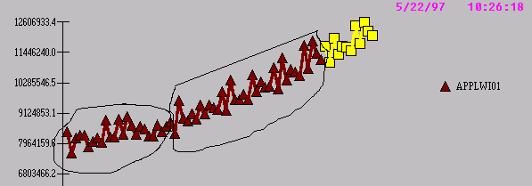
Example F
Given that one has observed
or collected N data values, how does one determine how many of them to use in
constructing a model. The answer to
this question requires a study of the possible transient nature of
model/coefficients over time. We show a time series that has “a lumpy demand
structure“ for the first 50 months and then a “ random walk demand “ over the
last 50 points. Note that the second half (observations 51 to 100) more closely
follow an AR (1) model with value close to .9 .as compared to the -.9 value for
the first 50 data points.
Notice the difference
between the two regimes. AUTOBOX automatically scans and finds this break point
and then uses the most recent set (proven to be homogenous) in order to
construct the model and the forecast.
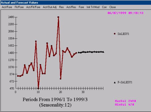
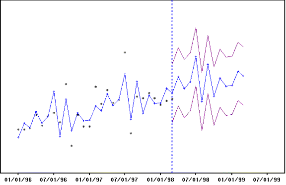
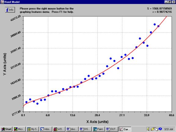
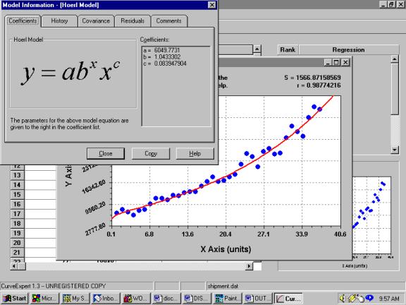
Example G
Some people get confused by
programs that fit versus programs that model. Consider the following real world
example of quarterly shipments.
Submitting this analysis to
a fitting program that tries a sequence (limited number) with no feedback from
the error structure in order to improve the model.
![]()
![]()
![]()
Culminating in
with visually obvious
deficiencies
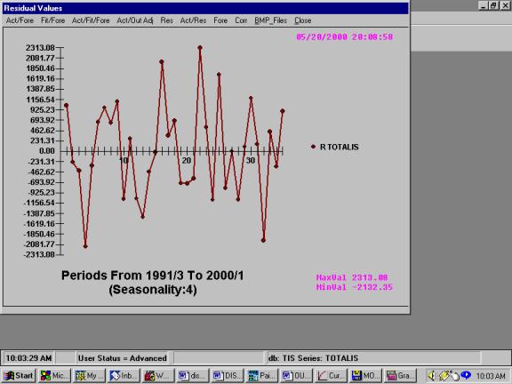
![]()
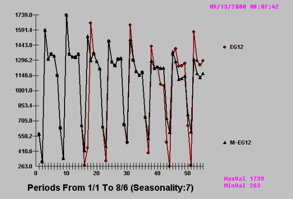
Here are the residuals from
the process which are clearly inadequate.
We now compare the results of AUTOBOX
notice that “FITOLOGISTS”
never forecast !
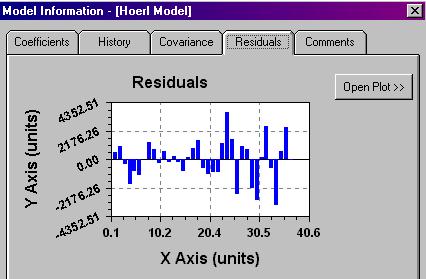
Autobox’s residuals showing
no apparent deficiencies.
Here are the actuals and the
residuals together:
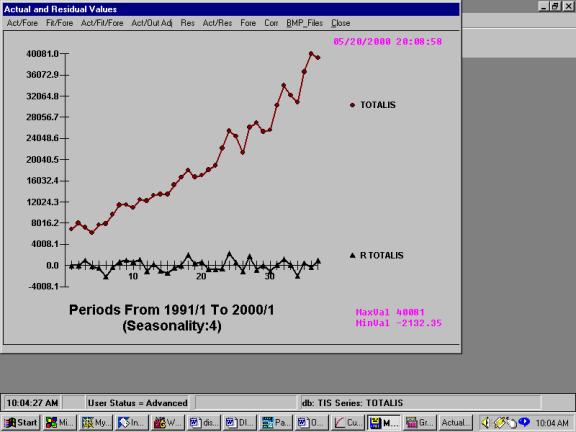
AUTOBOX detected changes in
trend and variance, leading to a sufficient model.
MULTIVARIATE
EXAMPLE H
Consider the following
regression result where we are evaluating the relationship between a variable
representing a “before and after variable”.
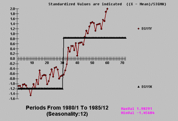
The standard ordinary least
squares regression test concludes that the cause variable is statistically
significant. Really!!!
The reason for the
significance is that the mean of Y for the first 30 observations is
statistically significantly different from the mean of Y for the last thirty
observations. You say , correctly ….who cares ! The reason being that we are
not , in this case, concerned with a test of the hypothesis of two means
because the series has trend.
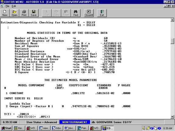
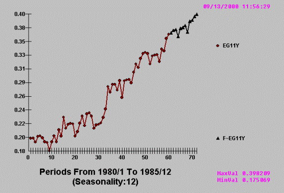
As compared to AUTOBOX’s automatic
model identification which reject the
assertion that the candidate X aids the understanding or behavior of Y.
EXAMPLE I
When you put on a promotion,
you usually increase sales (for that period), but sometimes (often) you reduce
sales in period(s) following the promotion (LAG effect). This is known as relocating
demand. Following is a graph of the history of sales depicting the promotion
points.
Notice the “morning after
effect” where sales are reduced because of the prior periods increase.
AUTOBOX identifies the
pattern and then projects the pattern into the future.
EXAMPLE J
Sometimes after you
pre-announce a promotion you lose sales prior to the promotion period. This is
the case of a LEAD effect. Following is a graph depicting a typical lead
effect.
Notice how the wise customer
reduces his demand prior to the promotion period. The circular for your local grocery chain infoms you about next
week’s sales.
AUTOBOX does and concludes

EXAMPLE K
Consider the case where the
regression effect between Y and X depends on the size of X. This happens quite
naturally with the sales of heaters as it relates to temperature. For
temperatures above 50 degrees there is no relationship while when the weather
dips below 50 degrees sales increase, as it gets colder. Also, the sale of fans
as it relates to weather (temperature). When the weather is under say 65
degrees there is no relationship while as it gets warmer (above 65 degrees)
sales go up.
This phenomena occurs in the
drug industry with sales of a drug might increase when the pollen count exceeds
a critical value or in the utility industry where as it get warmer you need
less electricity to heat the house and then as it gets warmer yet you need more
electricity to cool your house.
This is demand for Y as it
relates to X. Note how the regression changes. Clearly an average regression
would be inadequate. One has to identify the critical value where the
regression changes and then locally (in terms of X) develop the appropriate
coefficients.
Leading to:
EXAMPLE L
Some definitions first:
Spurious Relation (or Correlation) (a) - A
situation in which measures of two or more variables are statistically related
(they cover), but are not in fact causally linked—usually because the
statistical relation is caused by a third variable. When the effects of the
third variable are taken into account, the relationship between the first and
second variable disappears.
Lurking Variable - A third variable that
causes a correlation between two others - sometimes, like the troll under the
bridge, an unpleasant surprise when discovered. A lurking variable is a source
of a spurious correlation.
An investigator who takes
their correlation results as indicating a causal relationship is subject to a
plentiful source of criticisms - the artifact of the third variable. If it were
asserted from a significant correlation of A with B that A causes B. The critic
can usually rebut forcefully by proposing some variable C as the underlying causal
agent for both A and B.
A side bar: In "Lies,
Damn Lies & Statistics" (1933) M.S. Bartlett wrote a paper in the JRSS
entitled "Why do we sometimes get nonsense correlations with time
series?".
The following is a tongue in
cheek example of how two economic variables have a cross-correlation, but when
studied with AUTOBOX the predictor variable is not proven to have any
information.
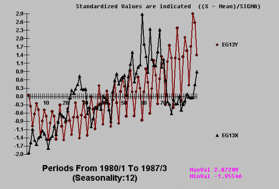
Using AUTOBOX we get:
This apparent
cross-correlation is based on the (incorrect) assumption that the series have no
internal autocorrelation. Once you account for the time series or
auto-projective component the cross-correlation becomes non-significant. The
concept of incorporating needed, but omitted variables is clear in time series
because the concomitant variable is usually obvious after its presence has been
detected via ARIMA structure with a conclusion that the X variable is not
significant above and beyond the historical impact of Y. There are many cases
where the ARIMA structure reduces the error variance enables a clearer picture
and the significance of a candidate variable.
This process of identification usually arises when conclusions are drawn
like "fireman cause damage because the more fireman you have at a fire the
more damage is reported” or
"storks bring babies based upon a per-capita analysis" or "the
number of words in a person's vocabulary depends on their foot size" or
"beer is a snob good because actual price was used rather than real
price". Another interesting question related to this is “did you ever
notice that there seems to be a correlation between the number of churches and
the number of bars in a city” …..perhaps church attendence causes drinking ?