Autobox Blog

Thoughts, ideas and detailed information on Forecasting.

  • Home
    Home This is where you can find all the blog posts throughout the site.
  • Categories
    Categories Displays a list of categories from this blog.
  • Tags
    Tags Displays a list of tags that has been used in the blog.
  • Bloggers
    Bloggers Search for your favorite blogger from this site.
Subscribe to this list via RSS Blog posts tagged in outliers sas

Posted by on in Forecasting

In 2011, IBM Watson shook our world when it beat Ken Jennings on Jeopardy and "Computer beats Man" was the reality we needed to accept.


IBM's WatsonAnalytics is now avalilabe for a 30 day trial and it did not shake my world when it came to time series analysis.  They have a free trial to download and play with the tool. You just need to create a spreadsheet with a header record with a name and the data below in a column and then upload the data very easily into the web based tool.


It took two example time series for me to wring my hands and say in my head, "Man beats Computer".  Sherlock Holmes said, "It's Elementary my dear Watson".  I can say, "It is not Elementary Watson and requires more than pure number crunching using NN or whatever they have".


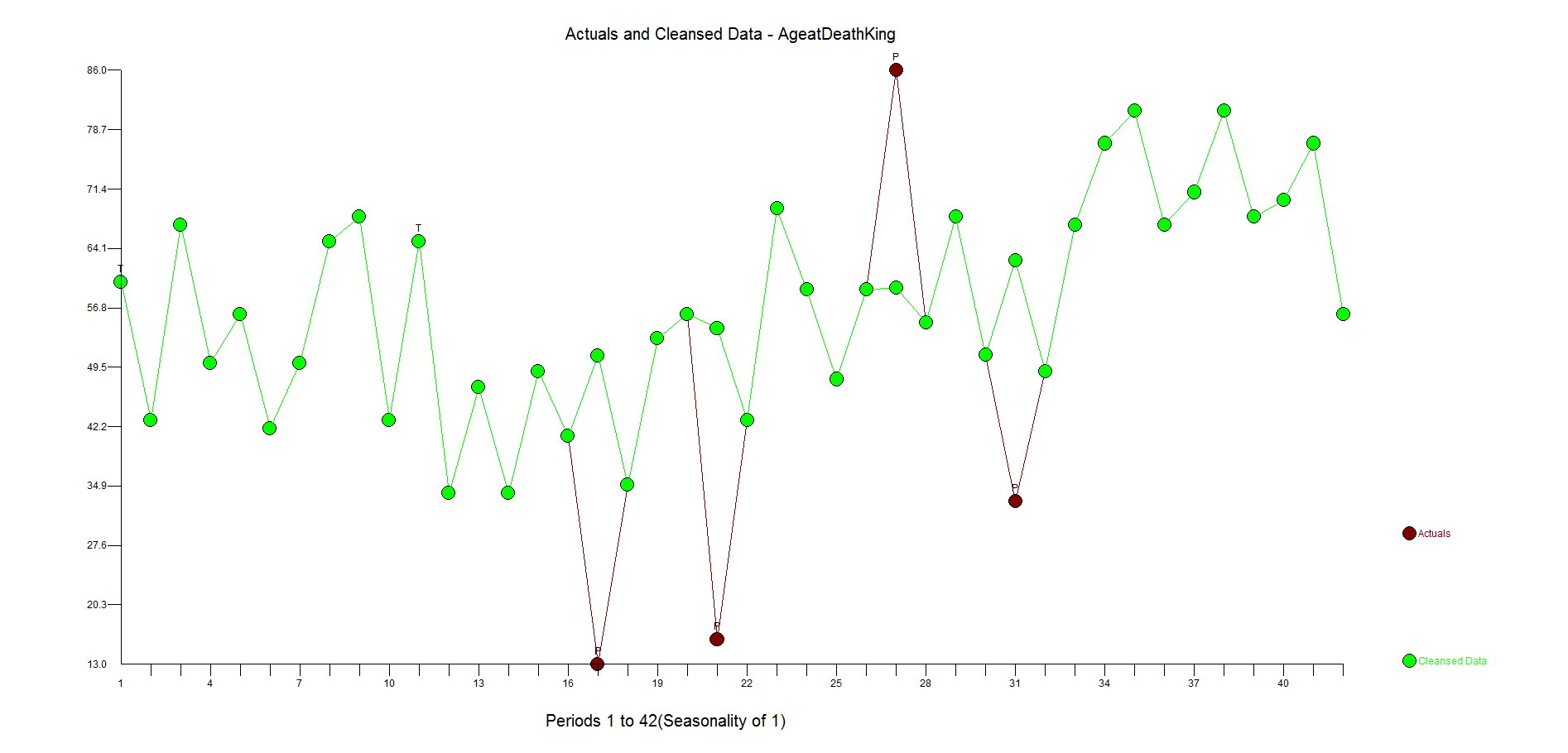
The first example is our classic time series 1,9,1,9,1,9,1,5 to see if Watson could identify the change in the pattern and mark it as an outlier(ie inlier) and continue to forecast 1,9,1,9, etc.  It did not.  In fact, it expected a causal variable to be present so I take it that Watson is not able to handle Univariate problems, but if anyone else knows differently please let me know.


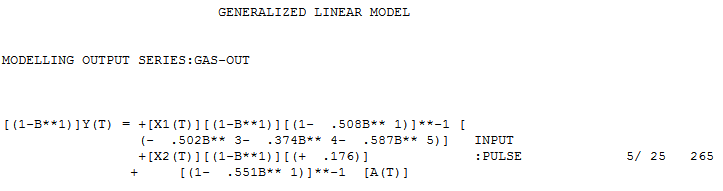
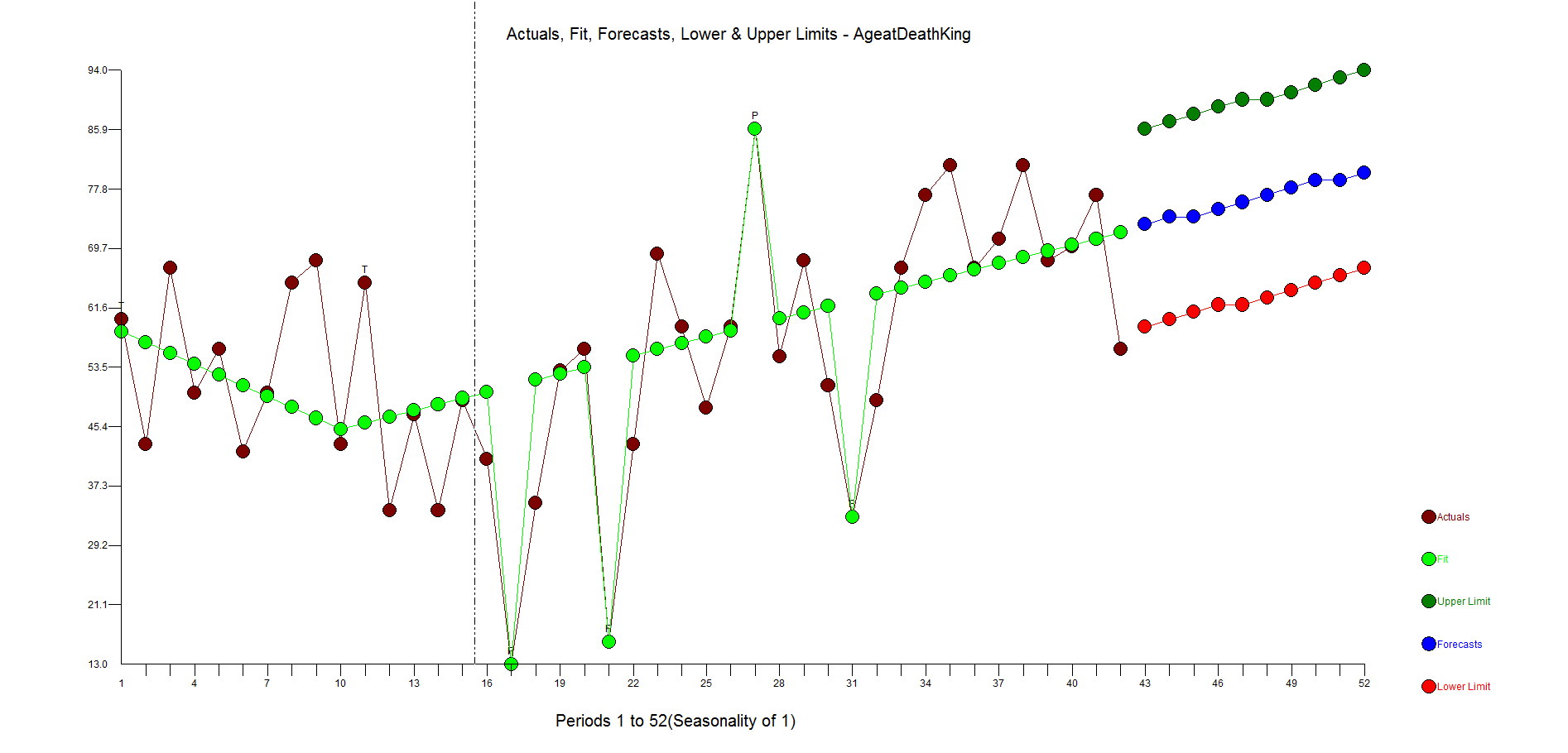
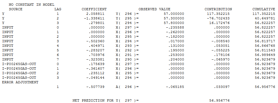
The second example was originally presented in the 1970 Box-Jenkin's text book and is a causal problem referred to as "Gas Furnace" and is described in detail in the textbook and also on NIST.GOV's website.  Methane is the X variable and Y is the Carbon Dioxide output.  If you know or now closely examine the model on the NIST website, you will see a complicated relationship where there is a complicated relationship between X and Y that occurs with a delay between the impact of X and the effect on Y (see Yt-1 and Yt-2 and Xt-1 and Xt-2 in the equation).  Note that the R Squared is above 99.4%!  Autobox is able to model this complex relationship uniquely and automatically.  Try it out for yourself here! The GASX problem can be found in the "BOXJ" folder which comes with every installed version of Autobox for Windows.

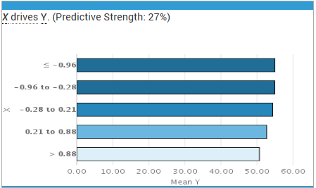
Watson did not find this relationship and offered a predictive strength of only 27%(see the X on the left hand of the graph) compared to 96.4%.  Not very good. This is why we benchmark. Please try this yourself and let me know if you see something different here.


gasx watson


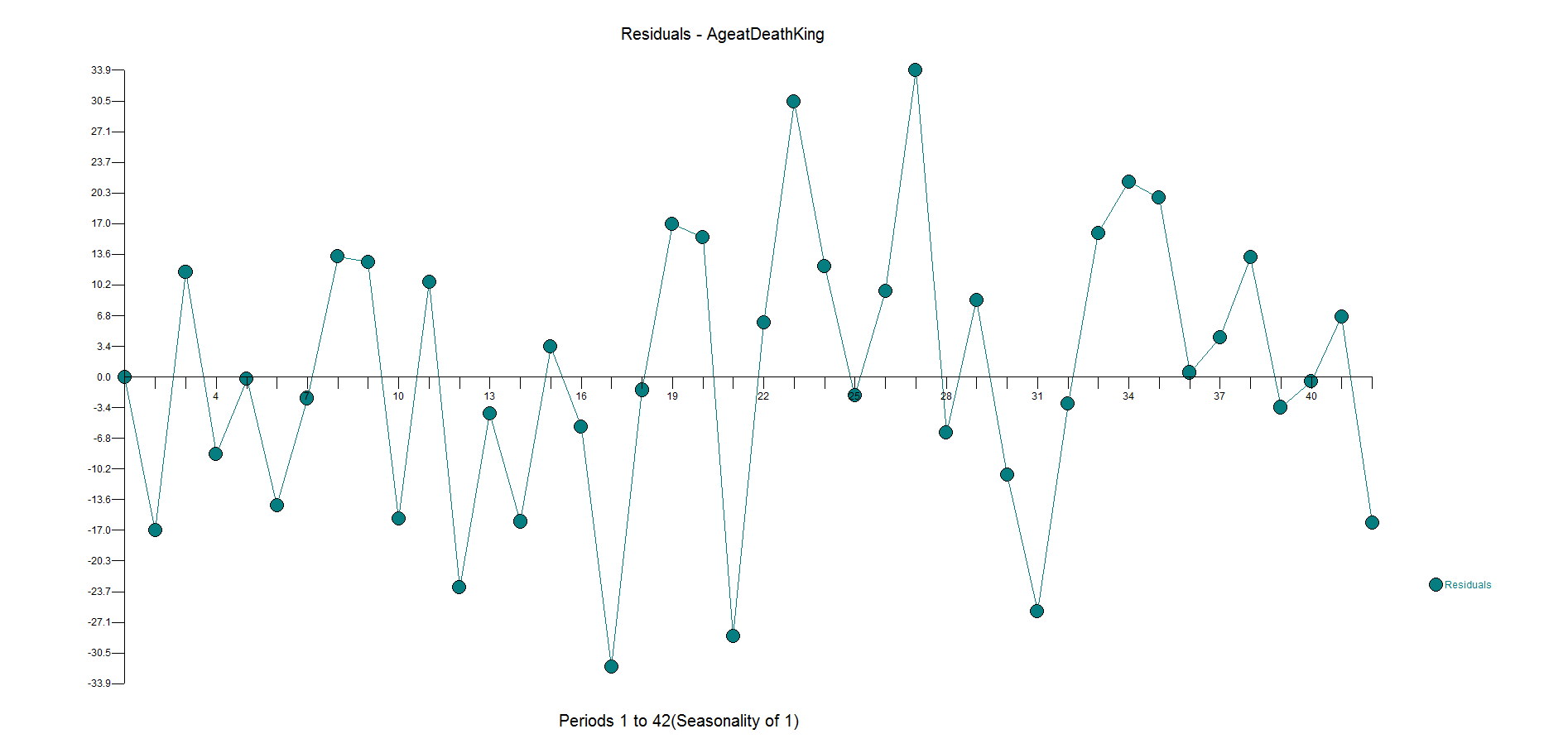
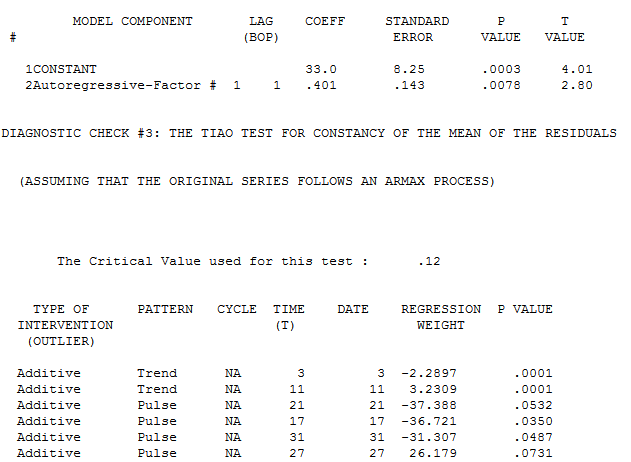
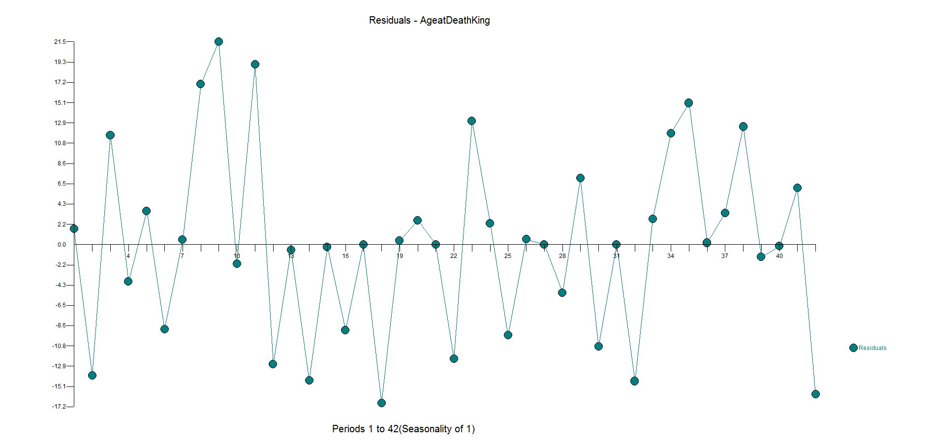
Autobox's model has lags in Y and lags in the X from 0 to 7 periods and finds an outlier(which can occur even in simulated data out of randomness).  We show you the model output here in a "regression" model format so it can be understood more easily. We will present the Box-Jenkins version down below.

gasx rhs


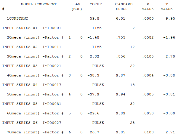
Here is a more parsimonious version of the Autobox model in pure Box-Jenkins notation.  Another twist is that Autobox found that the variance increased at period 185 and used Weighted Least Squares to do the analysis hence you will see the words "General Linear Model" at the top of the report.


gasx


You should be.  There is information to be MINED in the model.  Macro conclusions can be made from looking at commonalities across different series(ie 10% of the SKUs had an outlier four months ago---ask why this happened and investigate to learn what you are doing wrong or perhaps confirm what you are doing right!...and perhaps the other 90% SKUs also had some impact as well, but the model didn't detect it as it was borderline.  You could then create a causal variable for all of the SKUs and rerun and now 100% of the SKUs have the intervention(maybe constrain all of the causals to stay in the model or lower the statistical test to accept them into the model) modeled to arrive at a better model and forecast.  Let's explore more ways to use this valuable information:


LEVEL SHIFTS

When hurricane Sandy hit last October, it caused a big drop for a number of weeks.  Your model might have identified a "level shift" to react to the new average.  The forecast would reflect this new average, but we all know that things will return, but the model and forecast aren't smart enough to address that.  It would make sense to introduce a causal variable that reflected the drop due to the hurricane, BUT the future values of the causal would NOT reflect the impact so the forecast would return to the original level.  So, the causal would have a lot of leading zeroes, and 1's when the impact of Sandy was felt and 0's when the impact would disappear.  You could actually transition the 1 to a 0 gradually with some ramping techniques we learned from the famous modeler/forecaster Peg Young of the US DOT. The 0 dummy variable might increment like this 10,0,0,0,0,0,0,,1,1,1,1,1,1,1,.9,.8,.7,.6,.5,.4,.3,.2,.1,0,0,0,0,0,0,etc.


OUTLIERS

When you see outliers you should be reviewiing them to see if there is any pattern to them.  For example, if you don't properly model the "Super Bowl" impact, you might see an outlier on those days.  It takes a little time and effort to review and think "why" does this happen.  The benefits of taking the time to do this can have a powerful impact. You can then add a causal with a 1 in the history when the Supewr Bowls took place and then the provide a 1 for the next one.  For monthly data, you might see a low June as an outlier.  Don't adjust it to the mean as that is throwing the baby away with the bath water.  This means you might not be modeling the seasonality correctly. You might need an AR12, seasonal differencing or seasonal dummies.


SEASONAL PULSES

Let's continue with the low June example.  This doesn't necessarily mean all months have seasonality and assuming a model instead of modeling the data might lead to a false conclusion for the need of seasonality.  We are talking about a "seasonal pulse" where only June has an impact and the other months are near the average. This is where your causal dummy variable has 0's and a 1 on the low Junes and also the future Junes(ie 1,0,0,0,0,0,0,0,0,0,0,0,1).


This is a great example of how ignoring outliers can make you analysis can go very wrong.  We will show you the wrong way and then the right way. A quote comes to mind that said "A good forecaster is not smarter than everyone else, he merely has his ignorance better organized".

A fun dataset to explore is the "age of the death of kings of England".  The data comes form the 1977 book from McNeill called "Interactive Data Analysis" as is an example used by some to perform time series analysis.  We intend on showing you the right way and the wrong way(we have seen examples of this!). Here is the data so you can you can try this out yourself: 60,43,67,50,56,42,50,65,68,43,65,34,47,34,49,41,13,35,53,56,16,43,69,59,48,59,86,55,68,51,33,49,67,77,81,67,71,81,68,70,77,56

It begins at William the Conqueror from the year 1028 to present(excluding the current Queen Elizabeth II) and shows the ages at death for 42 kings.  It is an interesting example in that there is an underlying variable where life expectancy gets larger over time due to better health, eating, medicine, cyrogenic chambers???, etc and that is ignored in the "wrong way" example.  We have seen the wrong way example as they are not looking for deterministic approaches to modeling and forecasting. Box-Jenkins ignored deterministic aspects of modeling when they formulated the ARIMA modeling process in 1976.  The world has changed since then with research done by Tsay, Chatfield/Prothero (Box-Jenkins seasonal forecasting: Problems in a case study(with discussion)” J. Roy Statist soc., A, 136, 295-352), I. Chang, Fox that showed how important it is to consider deterministic options to achieve at a better model and forecast.

As for this dataset, there could be an argument that there would be no autocorrelation in the age between each king, but an argument could be made that heredity/genetics could have an autocorrelative impact or that if there were periods of stability or instability of the government would also matters. There could be an argument that there is an upper limit to how long we can live so there should be a cap on the maximum life span.

If you look at the dataset knew nothing about statistics, you might say that the first dozen obervations look stable and see that there is a trend up with some occasional real low values. If you ignored the outliers you might say there has been a change to a new higher mean, but that is when you ignore outliers and fall prey to Simpson's paradox or simply put "local vs global" inferences.

If you have some knowledge about time series analysis and were using your "rule book"on how to model, you might look at the ACF and PACF and say the series has no need for differencing and an AR1 model would suit it just fine.  We have seen examples on the web where these experts use their brain and see the need for differencing and an AR1 as they like the forecast.


You might (incorrectly), look at the Autocorrelation function and Partial Autocorrelation and see a spike at Lag 1 and conclude that there is autocorrelation at lag 1 and then should then include an AR1 component to the model.  Not shown here, but if you calculate the ACF on the first 10 observations the sign is negative and if you do the same on the last 32 observations they are positive supporting the "two trend" theory.

The PACF looks as follows:

Here is the forecast when using differencing and an AR1 model.


The ACF and PACF residuals look ok and here are the residuals.  This is where you start to see how the outliers have been ignored with big spikes at 11,17,23,27,31 with general underfitting with values in the high side in the second half of the data as the model is inadequate.  We want the residuals to be random around zero.


Now, to do it the right way....and with no human intervention whatsoever.

Autobox finds an AR1 to be significant and brings in a constant.  It then identifies to time trends and 4 outliers to be brought into the model. We all know what "step down" regression modeling is, but when you are adding variables to the model it is called "step up".  This is what is lacking in other forecasting software.


Note that the first trend is not significant at the 95% level.  Autobox uses a sliding scale based on the number of observations.  So, for large N .05 is the critical value, but this data set only has 42 observations so the critical value is adjusted.  When all of the variables are assembled in the model, the model looks like this:


If you consider deterministic variables like outliers, level shifts, time trends your model and forecast will look very different.  Do we expect people to live longer in a straight line?  No.  This is just a time series example showing you how to model data.  Is the current king (Queen Elizabeth II) 87 years old?  Yes.  Are people living longer?  Yes.  The trend variable is a surrogate for the general populations longer life expectancy.


Here are the residuals. They are pretty random.  There is some underfitting in the middle part of the dataset, but the model is more robust and sensible than the flat forecast kicked out by the difference, AR1 model.

Here is the actual and cleansed history of outliers. Its when you correct for outliers that you can really see why Autobox is doing what it is doing. 


Modeling ARIMA(x) or otherwise known as a Transfer Function models aren't easy to model especially with outliers.  A new book Data Quality for Analytics Using SAS by Gerhard Svolba from SAS shows this to be true.  Click on the link and you will see the graph and the explanation of which outliers were identified.


I am going to make this post short and to the point.

The January 2007 value is an outlier and should have been flagged as one although the author tries to ignore it,  but we do not.

December 2006, January 2008, November 2008, December 2008 are also missed as they are clear outliers.

I will also point out the data seems to be trending up and the forecast is flat, but we don't know what the future values of the causals used so its tough to give a complete view here.

If you have the book and perhaps the data, post it here or send it to us and we will gladly analyze it or any data!

Follow up.....

We downloaded the data and SAS' Universal Viewer. The 4 data sets that they let you download only has transaction level data and it doesn't overlap the time frame for the example. So if the data is not listed in the book, the only way to get it would be to contact the author himself. Here is the author's contact page if anyone wants to do that.

http://support.sas.com/publishing/bbu/companion_site/info.html

Go to top