Autobox Blog

Thoughts, ideas and detailed information on Forecasting.

  • Home
    Home This is where you can find all the blog posts throughout the site.
  • Categories
    Categories Displays a list of categories from this blog.
  • Tags
    Tags Displays a list of tags that has been used in the blog.
  • Bloggers
    Bloggers Search for your favorite blogger from this site.
Subscribe to this list via RSS Blog posts tagged in cran ets auto.arima gretl rats

Alteryx is using the free "forecast" package in R. This BLOG is really more about the R forecast package then it is Alteryx, but since this is what they are offering.....

In their example on forecasting(they don't provide the data with Alteryx that they review, but you can request it---we did!), they have a video tutorial on analyzing monthly housing starts.

While this is only one example(we have done many!!).  They use over 20 years of data.  Kind of unnecessary to use that much data as patterns and models do change over time, but it only highlights a powerful feature of Autobox to protect you from this potential issue.  We will discuss down below the use of the Chow test.

With 299 observations they determine of two alternative models (ie ETS and ARIMA)which the best model using the last 12 making a total of 311 observations used in the example. The video says they use 301 observations, but that is just a slight mistake.  It should be noted that Autobox doesn't ever withhold data as it has adaptive techniques which USE all of the data to detect changes.  It also doesn't fit models to data, but provides "a best answer".  Combinations of forecasts never consider outliers.  We do.

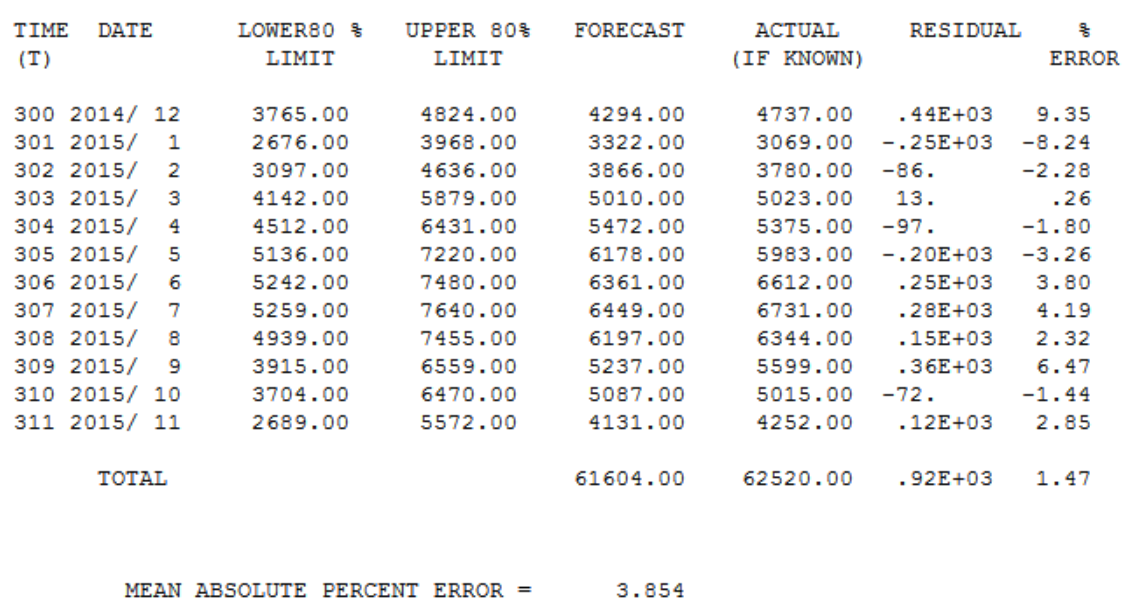
The MAPE for ARIMA was 5.17 and ETS was 5.65 which is shown in the video.  When running this in Autobox using the automatic mode, it had a 3.85 MAPE(go to the bottom). That's a big difference by improving accuracy by >25%.  Here is the model output and data file to reproduce this in Autobox.

Autobox is unique in that it checks if the model changes over time using the Chow test.  A break was identified at period 180 and the older data will be deleted.

      DIAGNOSTIC CHECK #4: THE CHOW PARAMETER CONSTANCY TEST
             The Critical value used for this test :     .01
             The minimum group or interval size was:     119

                    F TEST TO VERIFY CONSTANCY OF PARAMETERS                    
                                                                                
           CANDIDATE BREAKPOINT       F VALUE          P VALUE                  
                                                                                
               120 1999/ 12           4.55639          .0039929423              
               132 2000/ 12           7.41461          .0000906435              
               144 2001/ 12           8.56839          .0000199732              
               156 2002/ 12           9.32945          .0000074149              
               168 2003/ 12           7.55716          .0000751465              
               180 2004/ 12           9.19764          .0000087995*             

* INDICATES THE MOST RECENT SIGNIFICANT  BREAK POINT:    1% SIGNIFICANCE LEVEL. 

  IMPLEMENTING THE BREAKPOINT AT TIME PERIOD    180: 2004/   12 

  THUS WE WILL DROP (DELETE) THE FIRST   179 OBSOLETE OBSERVATIONS
  AND ANALYZE THE MOST RECENT   120 STATISTICALLY HOMOGENOUS OBSERVATIONS


DIAGNOSTIC CHECK #4: THE CHOW PARAMETER CONSTANCY TEST The Critical value used for this test : .01 The minimum group or interval size was: 119 F TEST TO VERIFY CONSTANCY OF PARAMETERS CANDIDATE BREAKPOINT F VALUE P VALUE 120 1999/ 12 4.55639 .0039929423 132 2000/ 12 7.41461 .0000906435 144 2001/ 12 8.56839 .0000199732 156 2002/ 12 9.32945 .0000074149 168 2003/ 12 7.55716 .0000751465 180 2004/ 12 9.19764 .0000087995* * INDICATES THE MOST RECENT SIGNIFICANT BREAK POINT: 1% SIGNIFICANCE LEVEL.

The model built using the more recent data had seasonal and regular differencing, an AR1 and a weak AR12.  Two outliers were found at period 225(9/08) and 247(7/10).  If you look at September's they are typically low, but not in 2008. July's are usually high, but not in 2010.  If you don't identify and adjust for these outliers then you can never achieve a better model.  Here is the Autobox model                                                                                                               

[(1-B**1)][(1-B**12)]Y(T) =                                                                                   
         +[X1(T)][(1-B**1)][(1-B**12)][(-  831.26    )]       :PULSE          2010/  7   247
         +[X2(T)][(1-B**1)][(1-B**12)][(+  613.63    )]       :PULSE          2008/  9   225
        +     [(1+  .302B** 1)(1+  .359B** 12)]**-1  [A(T)]

Alteryx ends up using an extremely convoluted model.  An ARIMA(2,0,2)(0,1,2)[12] with no outliers. That is a whopping 6 parameters vs Autobox's 2 parameters.

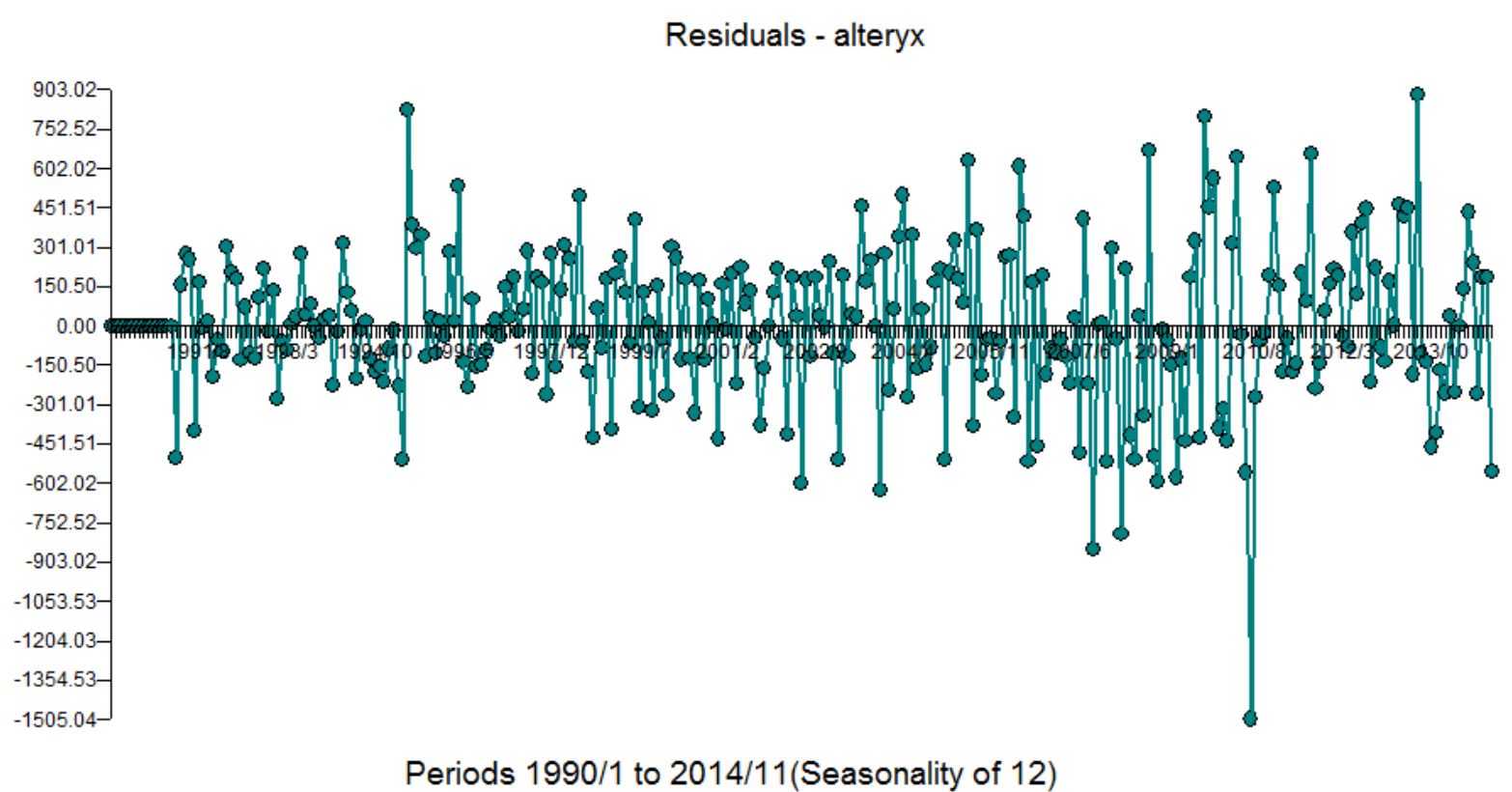
Let's take a look at the residuals. It tells everything you need to know.  Period 200 to 235 the model is overfitting the data causing there to be a large are mismodeled. Remember that Autobox found a break at period 180 which is close to period 200. The high negative error(low residual) is the July 2010 outlier that Autobox identifies.  If you ignore outliers they play havoc with your model.


Here is the table for forecasts for the 12 withheld periods.


Posted by on in Forecasting

This graph is from a client and while it is only one series, it is so illustrative. The lesson here is to model and not fit. There might not be strong enough seasonality to identify it when you only have a few months that are seasonal, unless you are LOOKING for exactly that.  Hint: The residuals are gold to be mined.

This will be our shortest BLOG ever, but perhaps the most compelling? Green is FPro.  Red is Autobox. Actuals are in Blue.

The most studied time series on the planet would have to be the Box-Jenkins International Airline Passenger series found in their 1970 landmark textbook Time Series Analysis: Forecasting and Control.  Just google AirPassengers or "airline passenger arima" and you will see it all over the place. It is on every major forecasting tool's website as an example.  It is there with a giant flaw.  We have been waiting and waiting for someone to notice.  This example has let us known (for decades) that we have a something that the others don't...robust outlier detection.  Let's explore more on why and how you check it out yourself.

It is 12 years of monthly data and Box-Jenkins used Logs to adjust for the increasing variance.  They didn't have the research we have today on outliers, but what about everyone else?  I. Chang had an unpublished dissertation(look for the name Chang) at University of Wisconsin in 1982 laying out an approach to detect and adjust outliers providing a huge leap in modeling power.

It was in 1973 that Chatfield and Prothero published a paper where the words "we have concerns" regarding the approach Box-Jenkins took with the Airline Passenger time series.  What they saw was a high forecast that turned out to be too aggressive and too high.  It is in the "Introduction" section. Naively, people think that when they take a transformation and make a forecast and then inverse transform of the forecast that they are ok. Statisticians and Mathematicians known that this is quite incorrect.  There is no general solution for this except for the case of logarithms which requires a special modification to the inverse transform. This was pointed out by Chatfield in his book in 1985.  See Rob Hyndman's discussion as well.

We do question why software companies, text books and practitioners that didn't check what assumptions and approaches that previous researchers said was fact. It was "always take Logs" for the Airline series and so everyone did.  Maybe this assumption that it was optimal was never rechecked?  I would imagine with all of the data scientists and researchers with ample tools would have found this out by now(start on page 114 and read on---hint:you won't find the word "outlier" in it!). Maybe they have, but haven't spread the word?  We are now. :)

We accidently discovered that Logs weren't needed when we were implementing Chang's approach.  We ran the example on the unlogged dataset and noticed the residuals variance was constant.  What?  No need to transform??

Logs are a transformation.  Drugs also transform us.  Sometimes with good consequences and sometimes with nasty side effects.  In this case, the forecast for the Passenger was way too high and it was pointed out but went largely unnoticed(not by us).

Why did their criticism get ignored or forgotten?  Either way, we are here to tell you that across the globe in schools and statistical software it is repeating a mistake in methodology that should be fixed.

Here is the model that Autobox identifies.  Seasonal Differencing, an AR1 with 3 outliers.  Much simpler than the Regular, Seasonal Differencing, MA1, MA12 model ....with a bad forecast.  The forecast is not as aggressive.  The outlier in March 1960 is the main culprit(period 135), but the others are also important. If you limit Autobox to search for one outlier is finds the 1960 outlier, but it still uses Logs so you need to "be better". It caused a false positive F test that logs were needed.  They weren't and aren't needed!


The Residuals are clear of any variance Trend.


Here is a Description of the Possible Violations of the Assumptions of Constancy of the Mean and Variance in Residuals and How to Fix it.


Mean of the Error Changes: (Taio/Box/Chang)

1. A 1 period change in Level (i.e. a Pulse )

2. A contiguous multi-period change in Level (Intercept Change)

3. Systematically with the Season (Seasonal Pulse)

4. A change in Trend (nobody but Autobox)

Variance of the Error Changes:

5. At Discrete Points in Time (Tsay Test)

6. Linked to the Expected Value (Box-Cox)

7. Can be described as an ARMA Model (Garch)

8. Due to Parameter Changes (Chow, Tong/Tar Model)


SAP has a webpage with a tutorial on using their Predictive Analytics 2.3 tool(formerly KXEN Modeler)using daily data.  They released this back in December, but didn't see until browsing Twitter. It provides an unusual public record of what comes out of SAP. They didn't publish the model with p-values and all of the output, but this is good enough to compare against.  We ran numerous scenarios with different modeling options to understand what the outcome would be using these modeling(ie variable) techniques.  Autobox has some default variables it brings in with daily data.  We will have to suppress some of those features so that when we use the SAP variables they don't collide with them and make a multicollinear regression.

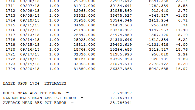
The Tutorial is well written and allows you to easily download the 1,724 days of data and model this yourself. While SAP had a .13 MAPE(in sample), they had a challenge at the end for those who get a MAPE less than .12 to contact them.  Can you predict what Autobox did? .0724.  Guess who is going to contact them? I will also add, that if you can do better contact us as we might have something to learn too.  I also suggest that you post how other tools handle this as well as that would be interesting to see as well. Autobox thrives(1st among automated) on daily data as it did in a daily forecasting competition and is much more difficult to model and something we have dedicated 25 years to perfecting.

After reading the SAP user's guide let's make the distinction that Autobox uses all of the data to build the model, while SAP (like all other tools) withholds data to "train" on.

Autobox adjusts for outliers. One could argue that by using adjusting for outliers the MAPE will only go down which is true, but it be aware that it allow for a clearer identification of the relationships in the data( ie coefficients / separating signal from noise).

The first approach in the SAP tutorial is running with only historical data and they add in the causals later. Outliers are identified and has a MAPE of .197.

66 Variables

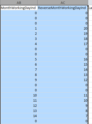
A bunch of very curious variables(66??----PenultimateWednesday) are included that we have never seen before which made us scratch our heads (with delight???). They seem to try and capture the day of the week so we will turn that off some of Autobox's searches to avoid collinearity when we run with these in the first pass. They seem to use a day of year variable which I have never seen before. What book are they getting ideas to use these kind of variables from? Not one that I have ever seen, but perhaps someone can enlighten me? There are two variables that are measuring the number of working days that have occurred in the month and the number left in the month. We did find that some of these variables do have importance in the tests we ran so SAP has some ideas generating useful variables, but many are collinear and this could be called "kitchen sink" modeling. We will do more research into these. There is a holiday variable which also flags working days so the two variables would seem to be collinear. These two end up as the second and third most powerful variables in the SAP model. When we tried these in Autobox, both runs found them significant. Perhaps they measure (implicitly) holidays too? We are not sure, but they help.
 

There are weather variables which are useful and actually represent seasonality so using both monthly dummies/weekly dummies and the weather variables could be problematic. The holidays have been all combined into one catch all variable. This assumes that each holiday behaves similarly. It should be noted that a major difference is that SAP does not search for lead or lag relationships around the causals while Autobox can do that. Just try running this example in Autobox and then SAP. We ran with all of these curious variables. We then reduced these variables and kept only Holiday, gust, rain, tmean, hmean, dmean, pmean, wmean, fmean, TubeStrike and Olympics and removed the curious other variables. The question which might arise "how much can you trust the weather predictions?", but here we are looking at only the MAPE of the fit so that is not a topic of concern.

SAP ended up with a .13 MAPE when using there long list of causals. The key here is that no outliers are identified in the analysis. This is a distinction and why Autobox is so different. If you ignore outliers they do still exist and yes they exist in causal problems. By ignoring something that doesn't mean it goes away, but ends up impacting you elsewhere such as the model and you likely aren't even aware of its impact. By not being able to deal with outliers your model with causals will be skewed, but no one talks about this in any school or text book so sorry to ruin this illusion for you. Alice in Wonderland(search on alice) thought everything was perfect too, until.....

Autobox does stepdown regression, but also does "stepup" where it will search for changes in seasonality(ie day of the week), trend/level/parameters/variance as things sometimes drastically change. If you're not looking for it then you will never find it! s. The MAPE we are presenting can be found in the detail.htm audit report from the Autobox run(hint:near the bottom). We suppressed the search for special days of the month which are useful in ATM data, but not theoretically plausible for this data. Autobox allows for holidays in the Top 15 GDP's, but in general assumes the data is from the US so we will need to suppress that search. We suppressed the search for special days of the month which are useful in ATM daily data as payday's are important, but not theoretically plausible for this data.

To summarize: We can run this a few different ways, but we can't present all of these results down below as it would be too much information to present here. We included some output and the Autobox file (current.asc-rename that if you want to reproduce the results) so you can see for yourself. What we do know is that including ARIMA increases run time.

MAPE's

  • Run using all variables with Autobox default options(suppressing US Holidays, day of month and monthly/weekly dummies). .0883
  • Run using all variables with Autobox default options(suppressing US Holidays, day of month and monthly/weekly dummies). Allow for ARIMA .0746
  • Run using a reduced set of variables(see above) & suppressing US holidays, day of month and monthly/weekly dummies). .1163
  • Run using a reduced set of variables(see above) & suppressing US holidays, day of month and monthly/weekly dummies). Allow for ARIMA .0732
  • Run using only Holiday, Strike/Olympics and rely upon monthly or weekly dummies. .1352
  • Run using only Holiday, Strike/Olympics and rely upon monthly or weekly dummies. Allow for ARIMA .1145
  • Run using a reduced set of variables, but remove the catch all "holiday" variable and create separate 6 main holiday variables that were flagged by SAP as they might each behave differently. (suppressing US Holidays, day of month, and monthly/weekly dummies) .1132
  • Run using a reduced set of variables, but remove the catch all "holiday" variable and create separate 6 main holiday variables that were flagged by SAP as they might each behave differently. (suppressing US Holidays, day of month, and monthly/weekly dummies). Allow ARIMA .0724

Let's consider the model that was used to develop the lowest MAPE of .0724.

There were 38 outliers identified over the 1,724 observations so the goal is not to have the best fit, but to model and be parsimonious.

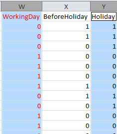
So, what did we do to make things right?  We started by deleting all kinds of variables.  There were linearly redundant variables such as WorkingDay that is perfectly correlated (inverse here) to Holiday which by definition should never be done when using dummy variables. The variable "Special Event" is redundant with TubeStrike and Olympics as well.  Special Event name isn't even a number, but rather text and also is redundant.
All other software withholds data whereas Autobox uses all of the data to build the model as we have adaptive technology that can detect change (seasonality/level/trend/parameters/variance plus outliers). We won best dedicated forecasting tool in J. Scott Armstrong's "Principles of Forecasting".  For the record, we politely disagree against a few of the 139 "Principles" as well.

We report the in sample MAPE, in the file "details.htm" seen below...


Another way to compare the Autobox and SAP results are by comparing side by side the actual and fit and you will clearly see how Autobox does a better job. The tutorial shows the graph for univariate, but unfortunately not for the causal run!  Here is the graph of the actual, fit and forecast. 
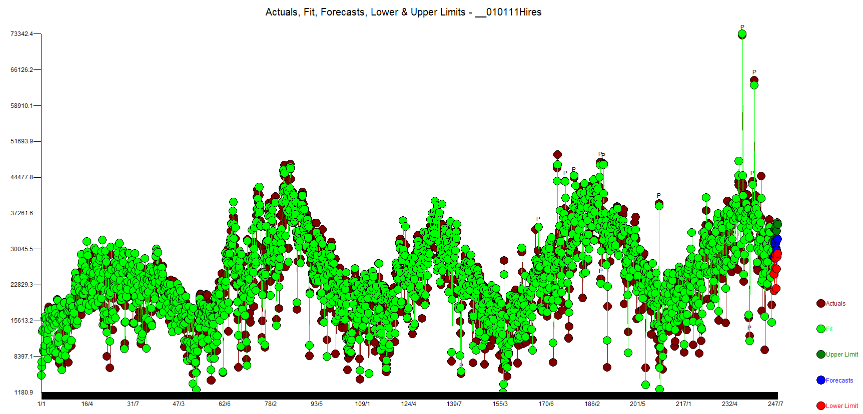
 

We prefer the actual and residuals plot as you can see the data more clearly.
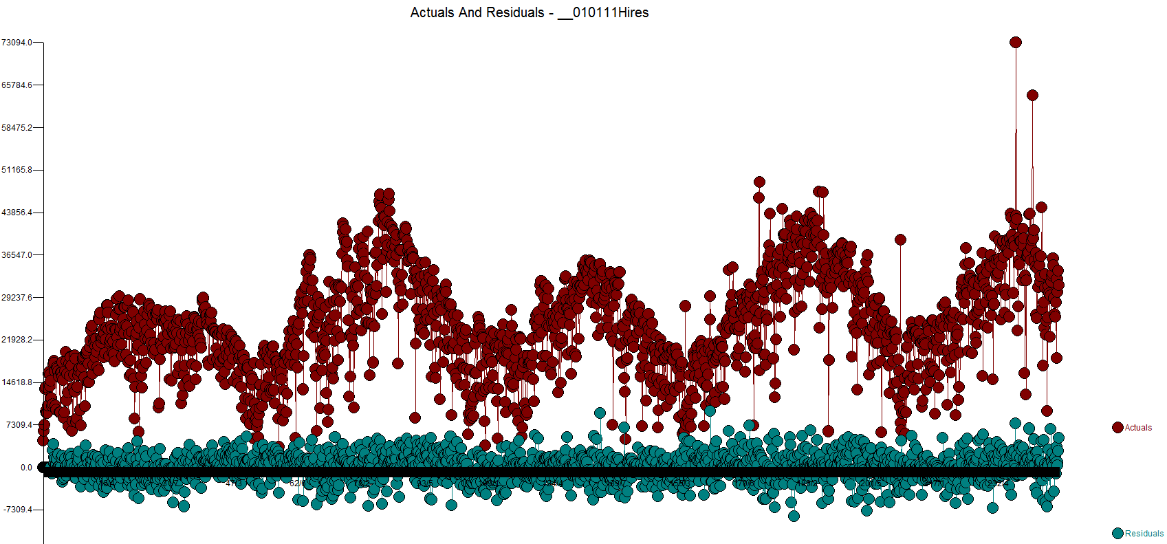
 

Let's review the model

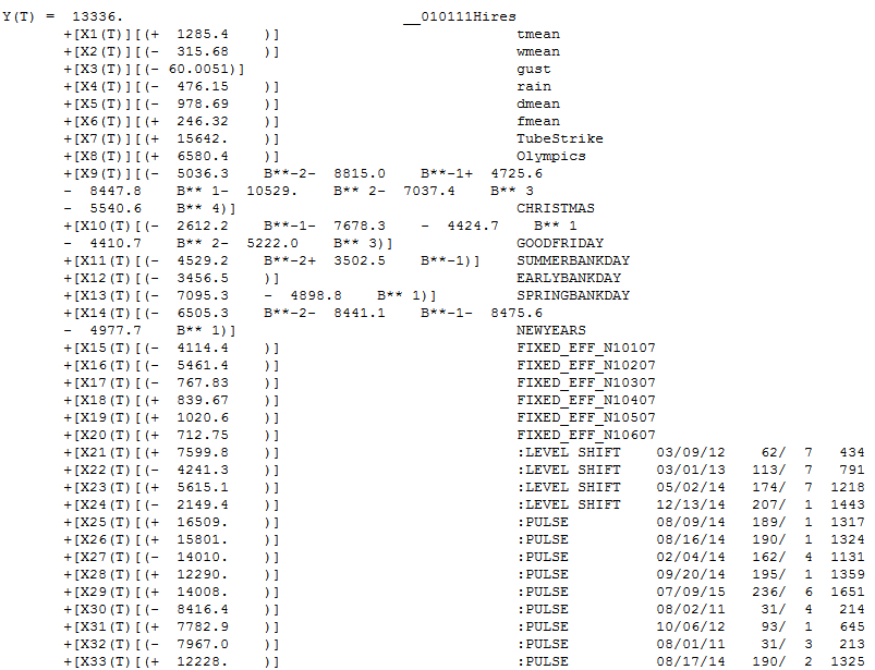
The sign of the coefficients make sense(for the UK which is cold).   When it's warmer people will skip the car and use the bike, for example so when Temperature goes up (+ sign) then people rent more bikes. When its gusty people will not and just drive. The tutorial explains the variables names in the back. tmean is average temperature,  w is wind,  d is dewpoint, h is humidity, p is barometric pressure, d is real feel temperature.   All 6 holidays were found to be important with all but one having lead or lag impacts.  When you see a B**-2 that means two days before the Christmas volume was low by 5036. Autobox found all 6 days of the week to be important.  The SAP Holiday variable was a mixture of Saturday and Sunday and causes some confusion with interpretation of the model.  This approach is much cleaner.  The first day of the data is a Saturday(1/1/2011) and the variable "FIXED_EFF_N10107" is measuring that impact that Saturday is low by 4114. Sunday is considered average as day 7 is the baseline.  See below  for more on the day of the week rough verification(ie pivot table/contribution %).

Note the "level shift' variables added to the model. This meant that the volume changed up or down for a period and Autobox identified and ADAPTED to it. We call this "step up regression"(nothing there right? Yes, we own that world!) as we are identifying on the fly deterministic variables and adding them to the model. The runs with the SAP variables fit 2012 much better. The first time trend began at period 1 with volume steadily increasing 10.5 units each day. This gets tampered down with the second time trend beginning at 177 making the net effect +4.3 increase per day. 38 outliers were identified which is the key to whole analysis. They are sorted by their entry into the model and really their importance.


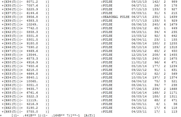
Note the Seasonal pulse where the first day becomes much higher starting at period 1639 and forward with an average 3956.8 higher volume.  Thats quite a lot and if you do some simple plotting of the data it will be very apparent.  Day 1 and Day 2 were always low, but over time Day 1 has become more average,  Note the AR1 and AR7 parameters.
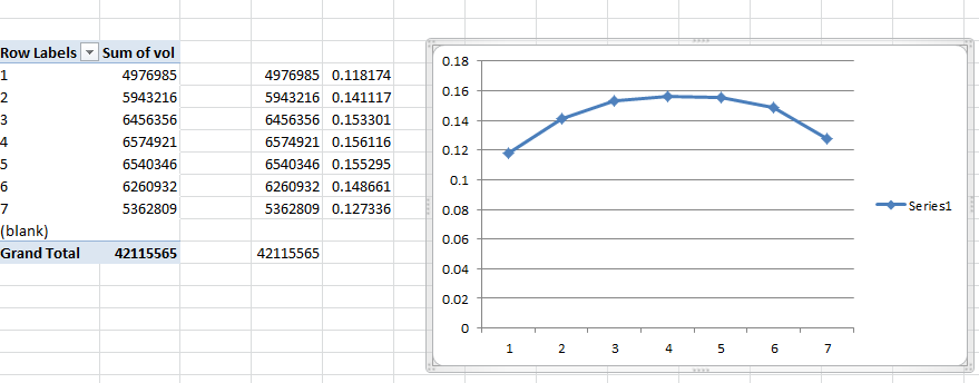
Let's consider the day of the week data by building a pivot table.
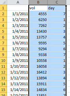
And getting this % of the whole. We call this the contribution %. Day 7 in Excel is Saturday which is low and notice Sunday(baseline) is even lower(remember that the holiday variable had a negative sign? The sign for Saturday was +1351.5 meaning it was 1351 higher than Sunday which matches the plot below. This type of summarization ignores trend, changes in day of the week impacts, etc. so be careful. We call this a poor man's regression because those percentages would be the coefficient if you ran a regression just using day of the week. It is directional, but by not means accurate as Autobox. We use this type of analysis to "roughly verify" Autobox with day of the week dummies, monthly dummies, and day of the month effects using pivot tables. The goal is not to overfit, but rather be parsimonious. Auto.arima is not parsimonious.


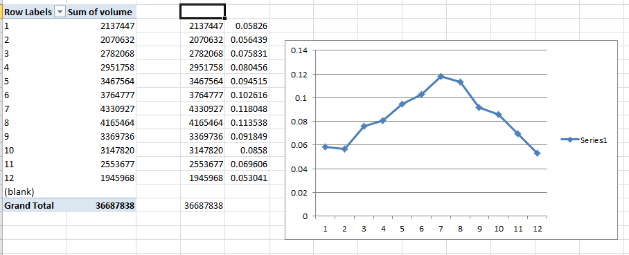
Let's look at the monthly breakout. Jan,Feb,Dec are average and the other months are higher with a slope up to the Summer months and down back to Winter.  The temperature data replaces the use of monthly or weekly dummies here.


Posted by on in Forecasting

In 2011, IBM Watson shook our world when it beat Ken Jennings on Jeopardy and "Computer beats Man" was the reality we needed to accept.


IBM's WatsonAnalytics is now avalilabe for a 30 day trial and it did not shake my world when it came to time series analysis.  They have a free trial to download and play with the tool. You just need to create a spreadsheet with a header record with a name and the data below in a column and then upload the data very easily into the web based tool.


It took two example time series for me to wring my hands and say in my head, "Man beats Computer".  Sherlock Holmes said, "It's Elementary my dear Watson".  I can say, "It is not Elementary Watson and requires more than pure number crunching using NN or whatever they have".


The first example is our classic time series 1,9,1,9,1,9,1,5 to see if Watson could identify the change in the pattern and mark it as an outlier(ie inlier) and continue to forecast 1,9,1,9, etc.  It did not.  In fact, it expected a causal variable to be present so I take it that Watson is not able to handle Univariate problems, but if anyone else knows differently please let me know.


The second example was originally presented in the 1970 Box-Jenkin's text book and is a causal problem referred to as "Gas Furnace" and is described in detail in the textbook and also on NIST.GOV's website.  Methane is the X variable and Y is the Carbon Dioxide output.  If you know or now closely examine the model on the NIST website, you will see a complicated relationship where there is a complicated relationship between X and Y that occurs with a delay between the impact of X and the effect on Y (see Yt-1 and Yt-2 and Xt-1 and Xt-2 in the equation).  Note that the R Squared is above 99.4%!  Autobox is able to model this complex relationship uniquely and automatically.  Try it out for yourself here! The GASX problem can be found in the "BOXJ" folder which comes with every installed version of Autobox for Windows.

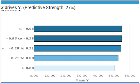
Watson did not find this relationship and offered a predictive strength of only 27%(see the X on the left hand of the graph) compared to 96.4%.  Not very good. This is why we benchmark. Please try this yourself and let me know if you see something different here.


gasx watson


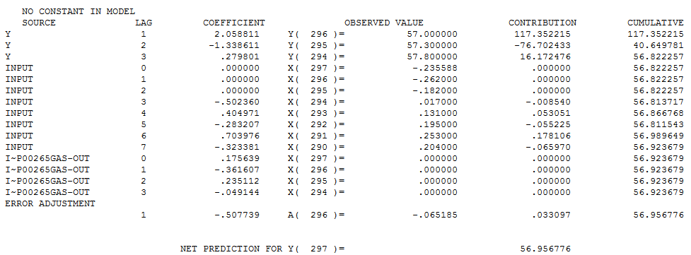
Autobox's model has lags in Y and lags in the X from 0 to 7 periods and finds an outlier(which can occur even in simulated data out of randomness).  We show you the model output here in a "regression" model format so it can be understood more easily. We will present the Box-Jenkins version down below.

gasx rhs


Here is a more parsimonious version of the Autobox model in pure Box-Jenkins notation.  Another twist is that Autobox found that the variance increased at period 185 and used Weighted Least Squares to do the analysis hence you will see the words "General Linear Model" at the top of the report.


gasx


It's been 6 months since ourlast BLOG.  We have been very busy.


We engaged in a debate on a linkedin discussion group over the need to pre-screen your data so that your forecasting algorithm can either apply seasonal models or not consider seasonal models.  A set of GUARANTEED random data was generated and given to us as a challenge four years ago.  This time we looked a little closer at the data and found something interesting. 1)you don't need to pres-creen your data 2)be careful how you generate random data


Here is my first response:

As for your random data, we still have it when you send it 4 years ago. I am not sure what you and Dave looked at, but if you download run the 30 day trial now and we always have kept improving the software you will get a different answer and the results posted here on dropbox.com.https://www.dropbox.com/s/s63kxrkquzc6e00/output_miket.zip

I have provided your data(xls file),our model equation (equ), forecasts(pro), graph(png) and audit of the model building process(htm).

Out of the 18 examples, Autobox found 6 with a flat forecast, 7 with 1 monthly seasonal pulse or a 1 month fixed effect, 4 with 2 months that had a mix of either a seasonal pulse or a 1 month fixed effect, 2 with 3 months that had a mix of either a seasonal pulses or a 1 month fixed effect.

Note that no model was found with Seasonal Differencing, AR12, with all 11 seasonal dummies.

Now, in a perfect world, Autobox would have found 19 flat lines based on this theoretical data. If you look at the data, you will see that there were patterns found where Autobox found them that make sense. There are sometimes seasonality that is not persistent and just a couple of months through the year.

If we review the 12 series where Autobox detected seasonality, it is very clear that in the 11 of the 12 cases that it was justified in doing so. That would make 17 of the 18 properly modeled and forecasted.

Series 1 - Autobox found feb to be low. A All three years this was the case. Let's call this a win.

Series 2 - Autobox found apr to be low. All three years were low. Let's that call this a win.

Series 3- Autobox found sep and oct to be low. 4 of the 6 were low and the four most recent were all low supporting a change in the seasonality. Let's call this a win.

Series 4- Autobox found nov to be low. All three years were low. Let's call this a win.

Series 5- Autobox found mar, may and aug to be low. All three years were low. Let's call that a win.

Series 7- Autobox found jun low and aug high. All three years matched the pattern. Let's call that a win.

Series 10 - Autobox found apr and jun to be high. 5 of the 6 data points were high. Let's call this a win.

Series 12 - Autobox found oct to be high and dec to be low. All three years this was the case. Let's call this a win.

Series 13 - Autobox found aug to be high. Two of the three years were very very high. Let's call this a win.

Series 14 - Autobox found feb and apr to be high. All three years this was the case. Let's call this a win.

Series 15 - Autobox found may jun to be high and oct low. 8 of the 9 historical data points support this, Let's call this a win.

Series 16 - Autobox found jan to below. It was very low for two, but one was quite high and Autobox called that an outlier. Let's call this a loss.

A little sleep and then I posted this response:

After sleeping on that very fun excercise, there was something that still wasn't sitting right with me. The "guaranteed" no seasonality statement didn't match with the graph of the datasets. They didn't seem to have randomness and seemed more to have some pattern.

I generated 4 example datasets from the link below. I used the defaults and graphed them. They exhibited randomness. I ran them through Autobox and all had zero seasonality and flat forecasts.

http://www.random.org/sequences/


We're trying to make easier for you to prove that Autobox isn't what we think it is.  Post your model, fit and forecast and we'll post Autobox's output. Anyone, feel free to post any other 30 day trial links here as well that are "time series analysis" related.

RATS

http://www.estima.com/ratsdemo.shtml


Minitab

http://www.minitab.com/en-US/products/minitab/free-trial.aspx


Salford Systems - They say they have time series in the new version of SPM 7.0, but we can't find it so this won't do you any good. Click on the top right of the screen if you want to try your luck.

http://www.salford-systems.com/products/spm/whats-new


SYSTAT

http://www.systat.com/SystatProducts.aspx


XL Stat

http://www.xlstat.com/en/download.html


GMDH Shell - New to the market. Click on the bottom of the screen to download. They offer the International Airline Passenger Series as soon as you run it. If you run it, it makes no attempt to identify the outliers known to be the demise of any modeler plus it has a very high forecast which was ther subject of criticism of Box-Jenkins using LOGS and ignoring the outliers. See Chatfield and Prothero's criticsm in the paper "Box-Jenkins seasonal forecasting: Problems in a case-study"

http://www.gmdhshell.com/


Here is the Passenger Series (monthly data) 144 obs

112.00

118.00

132.00

129.00

121.00

135.00

148.00

148.00

136.00

119.00

104.00

118.00

115.00

126.00

141.00

135.00

125.00

149.00

170.00

170.00

158.00

133.00

114.00

140.00

145.00

150.00

178.00

163.00

172.00

178.00

199.00

199.00

184.00

162.00

146.00

166.00

171.00

180.00

193.00

181.00

183.00

218.00

230.00

242.00

209.00

191.00

172.00

194.00

196.00

196.00

236.00

235.00

229.00

243.00

264.00

272.00

237.00

211.00

180.00

201.00

204.00

188.00

235.00

227.00

234.00

264.00

302.00

293.00

259.00

229.00

203.00

229.00

242.00

233.00

267.00

269.00

270.00

315.00

364.00

347.00

312.00

274.00

237.00

278.00

284.00

277.00

317.00

313.00

318.00

374.00

413.00

405.00

355.00

306.00

271.00

306.00

315.00

301.00

356.00

348.00

355.00

422.00

465.00

467.00

404.00

347.00

305.00

336.00

340.00

318.00

362.00

348.00

363.00

435.00

491.00

505.00

404.00

359.00

310.00

337.00

360.00

342.00

406.00

396.00

420.00

472.00

548.00

559.00

463.00

407.00

362.00

405.00

417.00

391.00

419.00

461.00

472.00

535.00

622.00

606.00

508.00

461.00

390.00

432.00


Does free software do what you thought it would?

For ANOVA and t-tests, the R packages are just fine as this type of statistics is pretty basic with not a lot of moving parts, but when you are trying to model time series data or to do pattern recognition with that data is much much more difficult.

Is there "version" control with the R software packages?  Yes, there seems to be.  Errors are documented and tracked in the Change log section.  Take a good close look at this log and the number of changes and the changes made.

Statistical forecasting software has been found to have different forecasts for the identical model and different estimates of the parameters.  Bruce McCullough from Drexel University has spent a large part of his statistical career publishing journal articles that debunk forecasting software and their errors.  Bruce first railed on Excel's inability to be trusted as a reliable source for statistics.  Others have taken up that same cause with Google's Spreadsheets.

A paper by Yalta showed problems with ARIMA modeling benchmarks in some packages and showing Autobox, GRETL, RATS, X-12-ARIMA to be correctly estimating models.  The references at the bottom of that paper show the main papers in this area of research, if you are interested.  Many of them McCullough's.

At a recent meeting with customers and prospects, the topic of whether R packages could be used for Corporate analysis came up.  We can tell you that it is being used for Corporate and personal and Dissertations and on and on.  We shared our experience with someone testing out the auto.arima forecasting package which had a model which was flawed.  Models are debatable for sure, but having "buggy" software is not just acceptable for a business or even research environment as bad forecasting has bad consequences. We would like to help you in your evaluation of your models. One way for you to do this is to take the residuals from your forecasting software model and enter it into a trial version of AUTOBOX (http://www.autobox.com/cms/index.php/30day). If AUTOBOX finds a model, other than a constant, then you can conclude that your model missed a piece of information and that you chose wrong with your current tool. Sometimes software is worth what you pay for it.

Most software has releases every year or every other year.  Extensive testing is performed on benchmarks to identify errors and prove that the software is stable.  Most software uses Regression testing to identify and correct for issues.  If a version gets created every other month or week can you trust it to run your Enterprise or even Dissertation?


Go to top